
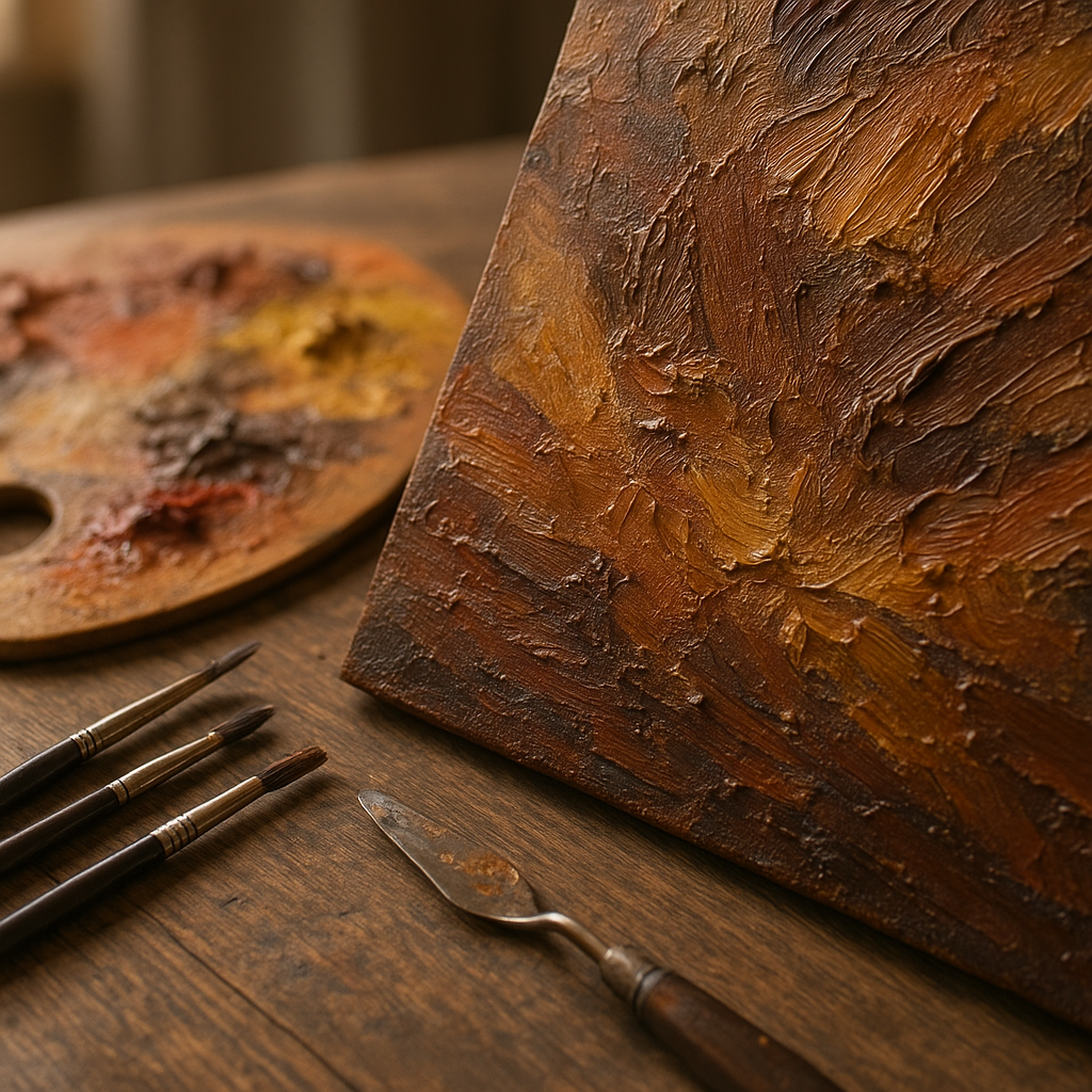
There’s a moment in oil painting when a flat canvas suddenly starts to breathe — when the background seems to recede, the foreground pops forward, and the whole thing feels three-dimensional. That moment doesn’t happen by accident. It’s the result of deliberate technique, patient layering, and an understanding of how light, color, and texture interact over time.
Oil paint is uniquely suited to building real depth. Unlike acrylics that dry fast and lock you in, oils stay workable long enough to push, pull, blend, and layer in ways that reward careful artists. But that flexibility can also lead to muddy results if the fundamentals aren’t solid. Whether you’re just starting out or looking to refine your approach, mastering layering and depth in oil painting is one of the most transformative skills you can develop.
Why Layering Is the Foundation of Oil Painting
Oil painting has been a layered medium since the Renaissance, when Flemish masters like Jan van Eyck developed the practice of building translucent glazes over opaque underpainting to achieve a luminosity that still looks breathtaking five centuries later. The technique wasn’t just stylistic — it was structural. Each layer serves a purpose, and understanding that purpose changes how you approach the canvas.
When you layer oil paint thoughtfully, you’re not just adding color on top of color. You’re creating optical mixing, where light passes through thin upper layers and reflects back from lower ones, producing a glow that can’t be faked with a single application. This is why a well-executed glaze looks so different from a flat coat of paint — the depth is literal, not simulated.
Understanding the Fat Over Lean Rule
Before diving into specific techniques, there’s one principle that every oil painter needs to internalize: fat over lean. This refers to the oil content of your paint layers. Lean layers (thinned with solvent, low oil content) should always go down first. Fat layers (with more oil or medium added) come later.
The reason is purely practical. Lean layers dry faster and more rigidly. If you paint a fat, oil-rich layer underneath a lean one, the bottom layer stays flexible longer while the top layer dries quickly and cracks. Reversing the order — fat on top of lean — keeps the painting structurally sound over time.
In practice, this means your initial sketched-in tonal underpainting should use paint thinned with turpentine or mineral spirits. As you build up through subsequent sessions, you gradually add more oil or medium to your mixes. By the final glazes, you may be using paint right out of the tube or even adding a little extra linseed or stand oil.
The 7-Layer Oil Painting Technique Explained
The so-called 7-layer oil painting technique comes from classical academic tradition and represents one of the most methodical approaches to building depth. The layers aren’t always distinct or numbered rigidly in modern practice, but understanding them gives you a clear framework.
- Sizing and ground preparation — sealing the canvas and applying a smooth painting surface
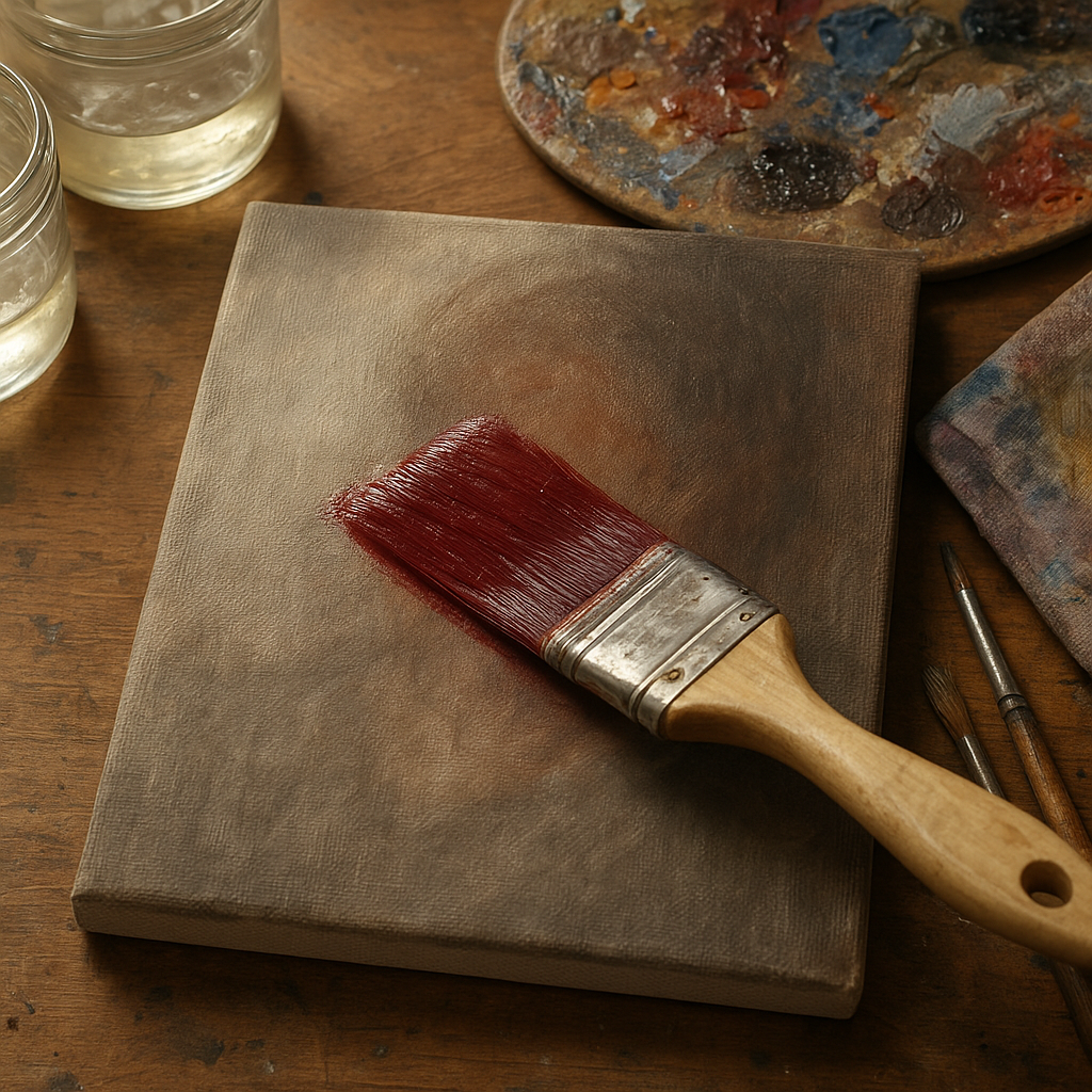
- Imprimatura — a thin, transparent tinted ground layer that kills the white of the canvas and sets a mid-tone
- Dead color (grisaille or verdaccio) — a monochromatic underpainting that establishes tonal values
- First color layer — establishing basic local colors in a lean, muted application
- Second color layer — refining colors, adding temperature variations and more specificity
- Glazing — transparent layers that unify, deepen, and add luminosity
- Final highlights and details — impasto strokes, sharp edges, and the brightest lights
Not every painting needs all seven steps, and many contemporary oil painters work much more spontaneously. But when you’re struggling to achieve depth, returning to this layered logic often solves the problem.
How to Show Depth in Oil Painting
Depth in painting is created through a combination of visual cues that mimic how the eye perceives three-dimensional space. There’s no single trick — it’s a layering (no pun intended) of multiple techniques used together.

Atmospheric Perspective
Objects in the distance appear lighter, cooler, and less detailed than those in the foreground. This happens in real life because of atmospheric haze. In painting, you replicate it by keeping your backgrounds soft, slightly blued or greyed, and relatively low in contrast. Your foreground, by contrast, should have your strongest darks, brightest lights, warmest colors, and sharpest edges.
Overlapping and Placement
When one object overlaps another, the viewer reads it as closer. Placing objects lower in the picture plane also reads as closer in traditional perspective. These are simple but powerful spatial cues that cost nothing technically but pay off enormously in how convincing a scene feels.
Value Contrast
Your most dramatic light-to-dark transitions should occur in the focal area closest to the viewer. As things recede, the value range should compress — meaning the lights get a little darker and the darks get a little lighter. This is one of the most commonly overlooked depth cues and one of the most effective. Leaning into these techniques for captivating visual impact can elevate an otherwise flat composition into something truly compelling.
Warm and Cool Temperature Shifts
Color temperature creates incredible depth when used deliberately. Warm colors tend to advance visually; cool colors recede. You can push a background further back simply by adding a touch of blue or grey to your mixes. Pull a foreground element forward with a warmer, more saturated version of the same hue.
Glazing: The Secret to Luminous Depth
If there’s one technique that most dramatically transforms the look of an oil painting, it’s glazing. A glaze is a transparent layer of oil paint — usually mixed with a glazing medium or a combination of linseed oil and a drying agent — applied over a completely dry underlayer.
Because the glaze is transparent, it doesn’t cover what’s beneath. Instead, it tints it. Light passes through the glaze, bounces off the opaque paint underneath, and returns to the eye carrying both the glaze color and the underlayer color simultaneously. The result is a depth and richness that’s physically impossible to achieve in a single opaque layer.
Glazing works best when the underlayer is fully dry and has some tooth or texture to hold the thin paint. Common glazing colors include the earth tones like burnt sienna and raw umber, along with transparent pigments like quinacridone rose, phthalo blue, and sap green. Opaque pigments like cadmium yellow or titanium white don’t glaze effectively — always check your paint’s transparency rating on the tube.
Impasto: Building Physical Texture and Dimension
While glazing adds optical depth through transparency, impasto adds literal, physical dimension to the surface. Impasto means applying paint thickly — sometimes straight from the tube, sometimes mixed with a bulking medium — so that brushstrokes and palette knife marks stand up from the surface.
This physical texture catches and redirects light in ways that flat paint simply can’t. When used strategically, impasto draws the eye to focal areas, suggests the texture of objects like rough stone or foliage, and creates a sense of energy and presence. When used carelessly, it just looks messy.
The classic combination is to use impasto for your lightest, brightest highlights — the areas catching direct light — while keeping your shadow areas thin and transparent. This mimics how light actually behaves: lit surfaces have material substance, while shadows are often best left slightly transparent so the underlayers breathe through.
The 80/20 Rule in Painting
The 80/20 rule in painting refers to the principle that roughly 80% of your painting should consist of larger, simpler passages, while only about 20% involves fine detail and tight work. It’s borrowed from the Pareto principle and it applies surprisingly well to how successful paintings are structured.
In terms of depth and layering, this rule encourages artists to resist the urge to detail everything equally. When you render every area with the same level of specificity, the eye has nowhere to rest and the painting loses hierarchy. Background passages should be painted broadly. The focal area gets the careful, detailed attention. This contrast between the two is itself a powerful depth cue — our eyes are trained to interpret detail as proximity.
The Six Rules of Depth in Painting
Traditional art instruction often organizes depth cues into what are called the six rules of depth (also sometimes called aerial or linear perspective principles). These are:
- Size — closer objects appear larger than distant ones
- Value — foreground elements have greater contrast; background compresses toward mid-tones
- Color temperature — warm advances, cool recedes
- Saturation — colors in the distance appear less saturated and more neutral
- Detail — the eye sees more detail up close; distant areas should be simplified
- Edges — foreground edges are sharp and defined; background edges are soft and blended
When all six of these work together in a painting, the spatial illusion becomes almost automatic. Many struggling paintings can be dramatically improved simply by auditing them against this list and correcting whichever rule is being violated.
Practical Tips for Building Your Layering Practice
Knowing the theory is one thing — putting it into regular practice is another. A few habits can make the layering process much more manageable:
- Work in sessions, not all at once. Proper layering requires dry underlayers. Trying to glaze over wet paint creates mud. Give yourself multiple short sessions over days or weeks rather than one marathon sitting.
- Start with a toned canvas. A neutral mid-tone ground (warm grey, raw umber, or even a very diluted imprimatura) gives you a unified starting point and makes it far easier to judge values accurately than working on blinding white.
- Establish your darkest darks early. In a transparent, layered approach, darks are easiest to achieve in early thin layers. Trying to push areas dark later often means adding opaque paint that covers what came before.
- Use a limited palette. Especially when learning to layer, fewer colors mean less chance of muddy mixes. A classic limited palette — cadmium yellow, cadmium red, ultramarine blue, burnt sienna, titanium white — can produce a remarkable range.
- Document your layers. Taking photos between sessions helps you track how the painting evolves and understand what each layer actually contributed.
Conclusion
Building real depth in oil painting is less about any single magical technique and more about understanding how layers interact over time. The fat over lean rule keeps your paintings structurally sound. Atmospheric perspective and the six rules of depth create convincing spatial illusions. Glazing adds luminosity that flat painting simply can’t match. Impasto creates physical dimension where you need the eye to be drawn. And the 80/20 rule keeps the whole composition organized and readable.
Oil paint rewards patience. The artists who achieve that elusive sense of light coming from within a painting are usually the ones who’ve learned to slow down, let layers dry, and build deliberately rather than trying to resolve everything in a single frantic session. Start with the fundamentals, practice them consistently, and the depth will follow.
